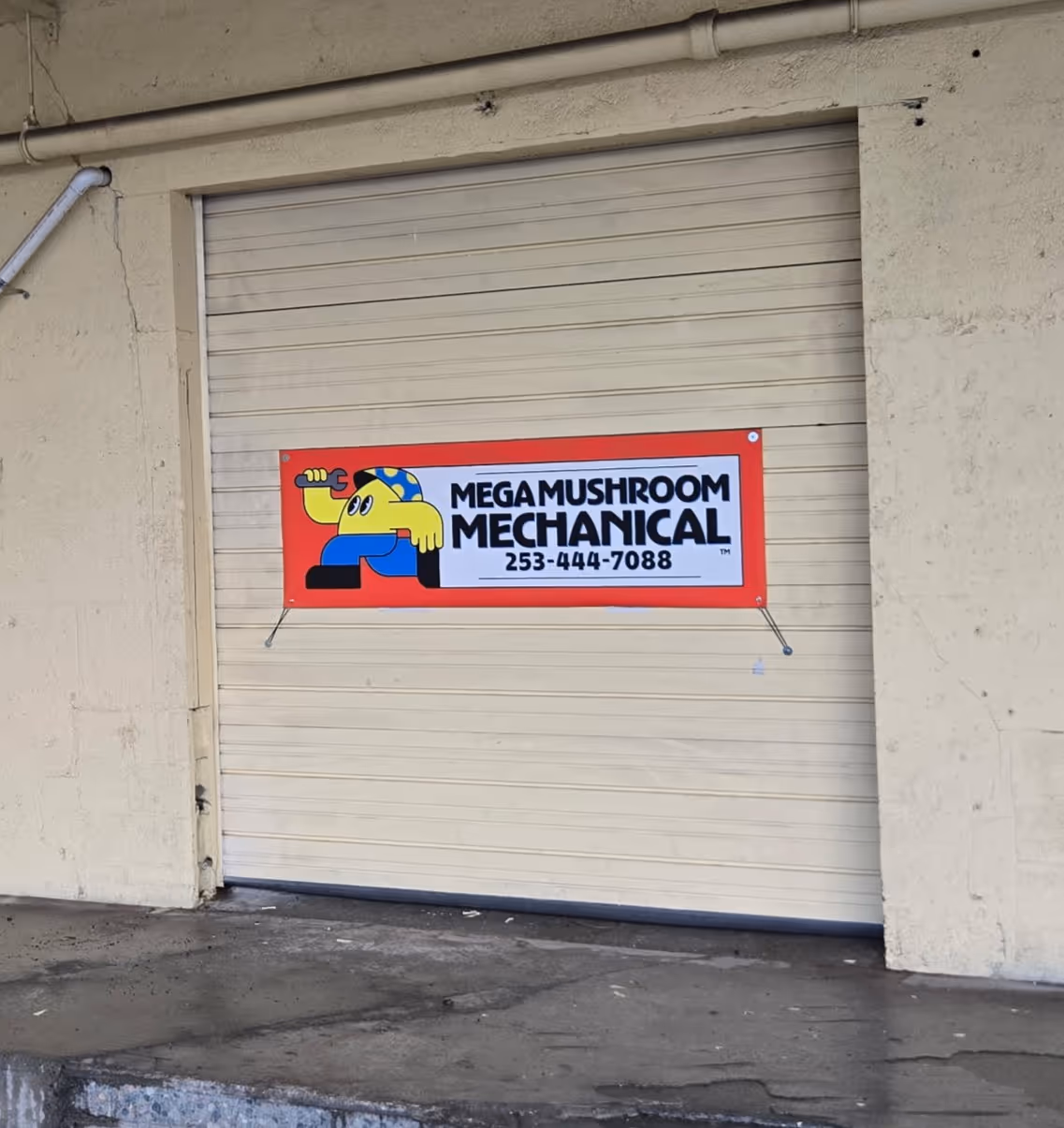
Logo

Logo Variations

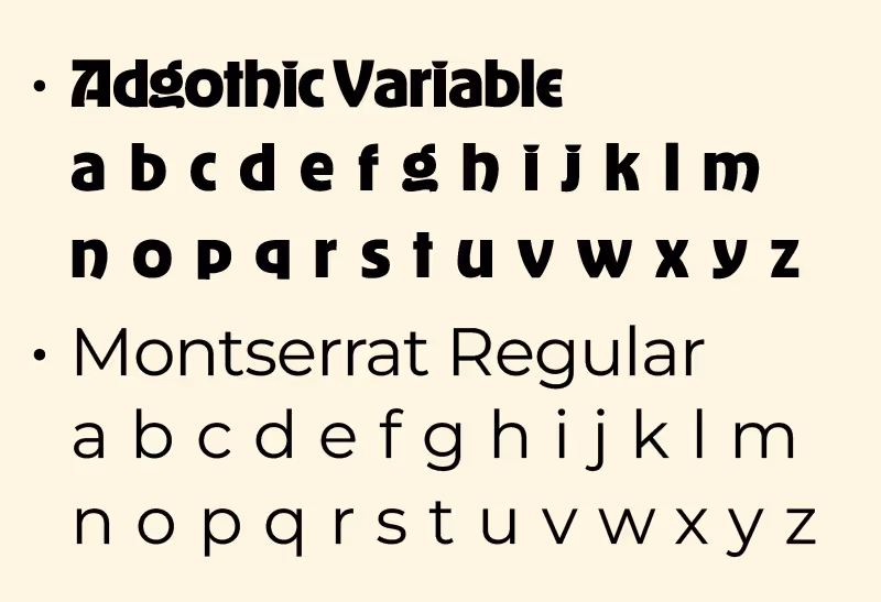
Type
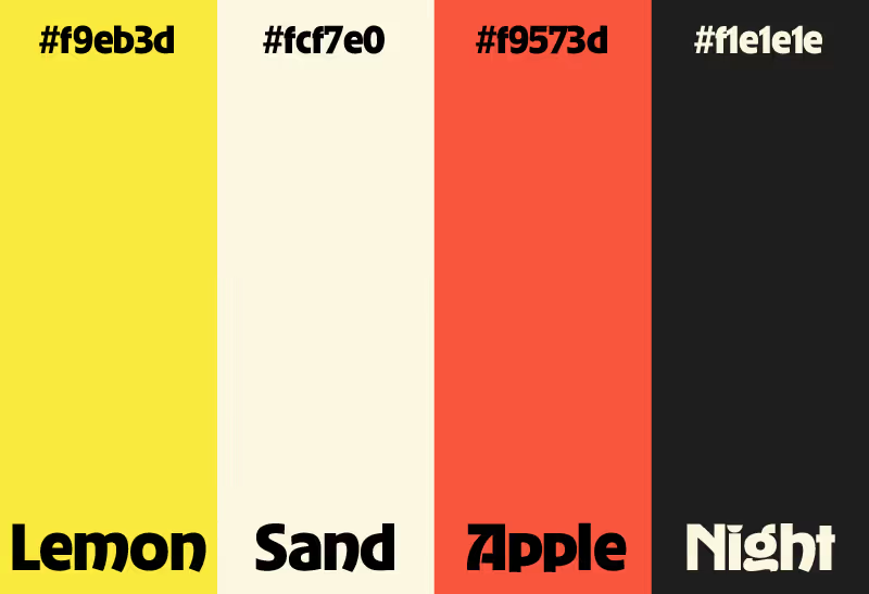
Palette
Lead designer, brand identity, copy witer, web design, marketing
6 months
Illustrator, Photoshop, Webflow
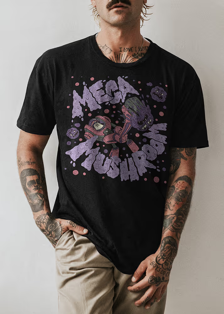
Brand Mega Mushroom, create a website that caters to customers while maintaining brand identity. Create merchandise and print ads that fit within the brand.
Mega Mushroom Mechanical is a plumbing business seeking a brand identity. Its owners are seeking a brand voice that sets itself apart from competition and pushes a friendlier and more playful identity than traditional plumbing businesses.
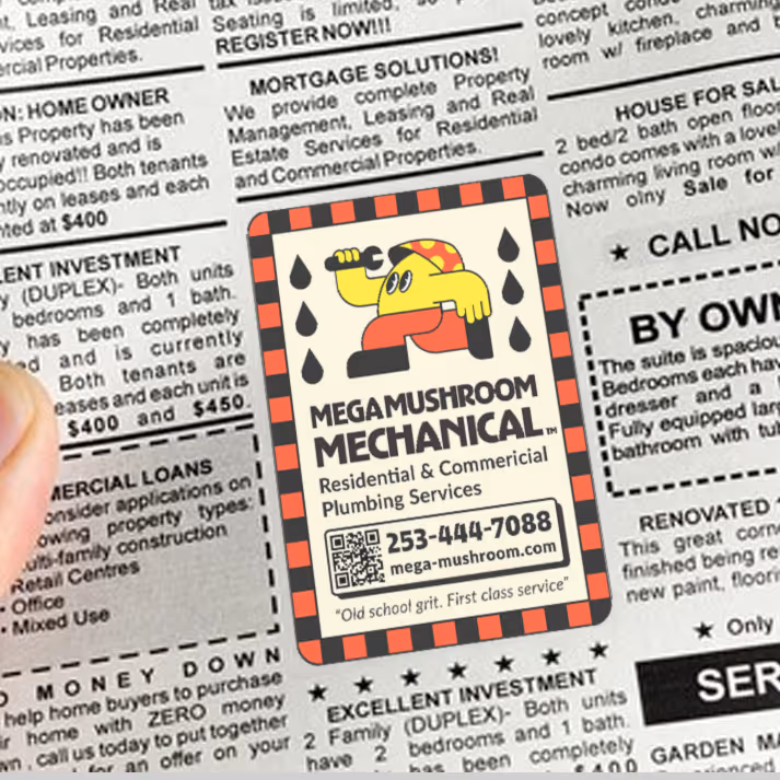
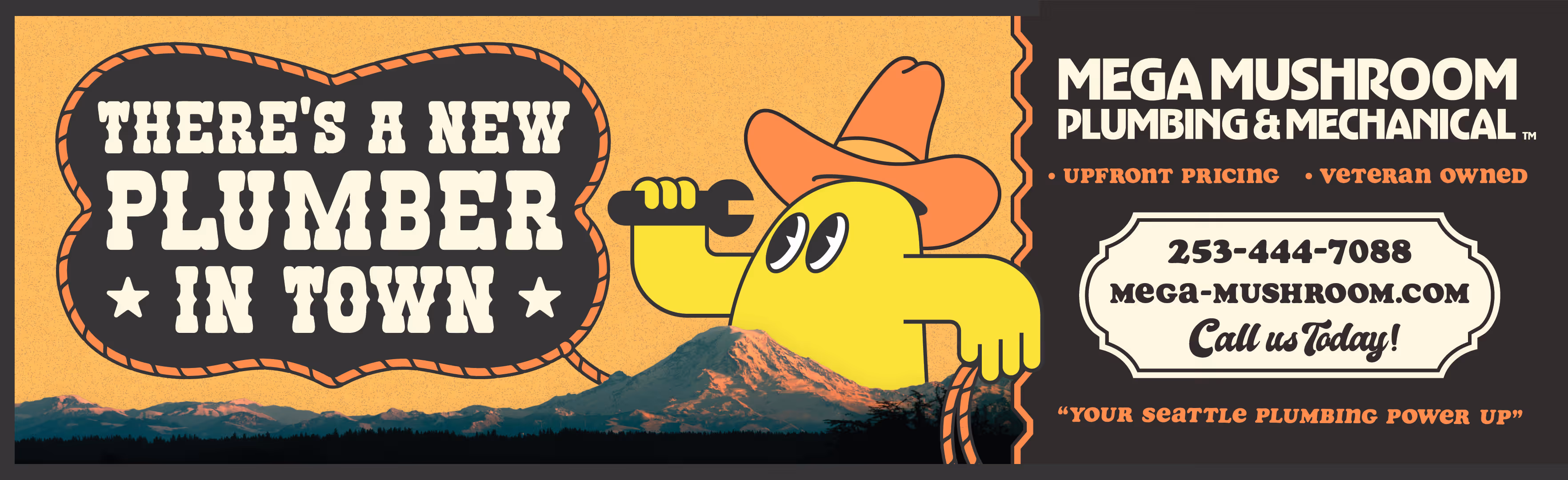
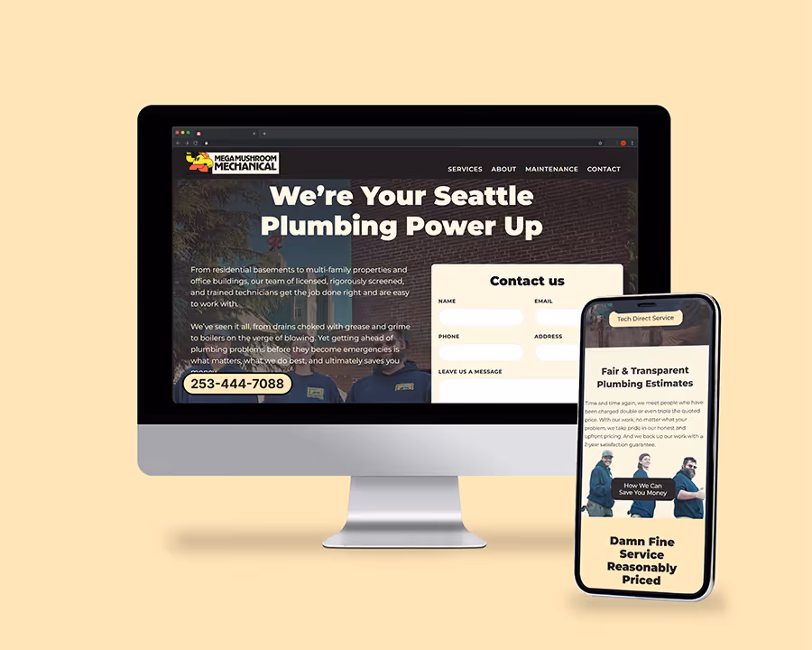
The solution balanced the company’s playful personality with the user’s need for clarity and trust by building a website that feels approachable, reliable, and easy to navigate. Playful branding elements, merchandise, and one off graphic pieces were used to showcase the company’s personality while creating a memorable and distinctive brand presence.
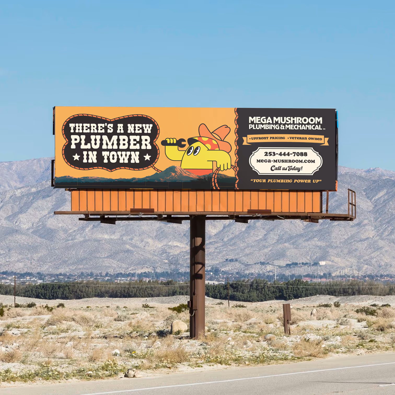


Mega Mushroom Mechanical is a Seattle-based plumbing company developing a distinct brand identity. The goal is to appeal to younger homeowners while presenting a more inclusive, approachable alternative to traditional blue-collar plumbing brands. The owners value creativity and fun, aiming to bring a sense of playfulness and personality into the visual identity.
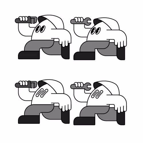
Defining the right tone for the logo was a challenge. I set out to create a mascot that felt friendly and approachable. My initial concept referenced Super Mario with 8-bit imagery, but I recognized its limited versatility and potential for confusion. I ultimately developed an original cartoon mascot, refining it through several iterations until it clearly communicated Mega Mushroom’s speed and service.
Establishing a single color palette proved more difficult. The owner preferred incorporating multiple palette options presented during the process. While this diverges from a strictly controlled brand system, the brand’s playful, local character allows for a more flexible and casual approach to color.
.avif)

.avif)
.avif)
.avif)

![[background image] image of architectural plans (for a construction company)](https://cdn.prod.website-files.com/image-generation-assets/112b9874-19c3-4bb3-b702-24bb2830a0d6.avif)